SVG-Dashboards/en: различия между версиями
(Новая страница: «Once uploaded, the image will be displayed on the open page: # Specify links and behavior of svg elements using link editor. # Save the changes and see the result by clicking on the '''Demo''' button.») |
|||
| (не показано 10 промежуточных версий этого же участника) | |||
| Строка 21: | Строка 21: | ||
Full-screen mode allows you to switch between panels through the side menu, and in HMI mode, you need to implement the switch yourself: add a button (object) with a URL to the desired panel in the SVG image. | Full-screen mode allows you to switch between panels through the side menu, and in HMI mode, you need to implement the switch yourself: add a button (object) with a URL to the desired panel in the SVG image. | ||
<gallery mode="packed" heights="150px" caption=" | <gallery mode="packed" heights="150px" caption="Режимы панелей"> | ||
Image: WebUI SVG.png | Standard view | Image: WebUI SVG.png | Standard view | ||
Image: WebUI SVG fullscreen.png | Fullscreen | Image: WebUI SVG fullscreen.png | Fullscreen | ||
| Строка 121: | Строка 121: | ||
The image is prepared in an external vector editor, but the assignment of links to elements is done in the controller web interface. | The image is prepared in an external vector editor, but the assignment of links to elements is done in the controller web interface. | ||
<div lang="ru" dir="ltr" class="mw-content-ltr"> | |||
Чтобы связать svg-элемент изображения со значениями или событиями, выберите его мышкой, после этого рядом с изображением появятся поля настройки поведения элемента. | |||
{{SupportedSinceRelease | {{SupportedSinceRelease | ||
| release = wb-2307 | | release = wb-2307 | ||
|content= | |content= | ||
Кроме выделения одиночного элемента, можно выделять группу. Для этого зажмите на клавиатуре клавишу Alt и кликните по одному из элементов группы. Будет выделена группа, куда входит элемент. Повторный клик при зажатой клавише Alt выберет группу уровнем выше и так далее до самого верха иерархии. | |||
</div> | |||
<div lang="ru" dir="ltr" class="mw-content-ltr"> | |||
Группы удобно использовать для создания кнопок: объединили в редакторе прямоугольник и иконку и получилась кнопка. | |||
}} | }} | ||
</div> | |||
<div lang="ru" dir="ltr" class="mw-content-ltr"> | |||
После настройки всех связи нажмите кнопку '''Сохранить'''. | |||
</div> | |||
=== | <div lang="ru" dir="ltr" class="mw-content-ltr"> | ||
=== Чтение === | |||
Отображение значений из источника в текстовом поле. | |||
</div> | |||
<div lang="ru" dir="ltr" class="mw-content-ltr"> | |||
Значение из выбранного в поле '''Канал''' источника помещается в переменную '''val''', которую нужно указать в поле '''Значение'''. | |||
</div> | |||
<div lang="ru" dir="ltr" class="mw-content-ltr"> | |||
<syntaxhighlight lang="javascript"> | Чтобы вывести значение, просто укажите переменную: | ||
<syntaxhighlight lang="javascript"> | |||
val | val | ||
</syntaxhighlight> | </syntaxhighlight> | ||
</div> | |||
<div lang="ru" dir="ltr" class="mw-content-ltr"> | |||
<syntaxhighlight lang="javascript"> | К значению можно добавить произвольный текст, например, единицу измерения: | ||
val + '°C' | <syntaxhighlight lang="javascript"> | ||
val + ' °C' | |||
</syntaxhighlight> | </syntaxhighlight> | ||
</div> | |||
<div lang="ru" dir="ltr" class="mw-content-ltr"> | |||
<syntaxhighlight lang="javascript"> | Также можно подменить полученное значение, например, заменить его на понятный человеку статус: | ||
(val == 1) ? ' | <syntaxhighlight lang="javascript"> | ||
(val == 1) ? 'ВКЛ' : 'ОТКЛ' | |||
</syntaxhighlight> | </syntaxhighlight> | ||
</div> | |||
=== | <div lang="ru" dir="ltr" class="mw-content-ltr"> | ||
=== Запись в канал === | |||
С помощью этой настройки вы можете записать значение в топик при клике пользователя по элементу. | |||
</div> | |||
<div lang="ru" dir="ltr" class="mw-content-ltr"> | |||
Доступно два состояния ON и OFF. При клике пользователя на элементе, значение в MQTT-топике будет меняться на противоположное. | |||
</div> | |||
<div lang="ru" dir="ltr" class="mw-content-ltr"> | |||
Выберите в поле '''Канал''' MQTT топик для записи значений, а в полях '''Значение включенного состояния''' и '''Значение выключенного состояния''' укажите какие значения соответствуют состояниям. | |||
</div> | |||
<div lang="ru" dir="ltr" class="mw-content-ltr"> | |||
<syntaxhighlight lang="javascript"> | Например, для переключения реле нужно указать: | ||
<syntaxhighlight lang="javascript"> | |||
Значение включенного состояния = 1 | |||
Значение выключенного состояния = 0 | |||
</syntaxhighlight> | </syntaxhighlight> | ||
</div> | |||
=== | <div lang="ru" dir="ltr" class="mw-content-ltr"> | ||
=== Переход и смахивания === | |||
{{SupportedSinceRelease | {{SupportedSinceRelease | ||
| release = wb-2307 | | release = wb-2307 | ||
|content= | |content= | ||
[[Image: svg-tap.png |300px|thumb|right| | [[Image: svg-tap.png |300px|thumb|right| Создание перехода ]] | ||
</div> | |||
<div lang="ru" dir="ltr" class="mw-content-ltr"> | |||
# | С помощью переходов можно создавать многостраничные интерфейсы: | ||
# | # Нарисуйте для каждой страницы свой рисунок. | ||
# | # Загрузите эти рисунки в контроллер. | ||
# Выберите для одного из трёх событий панель, куда надо переходить. | |||
</div> | |||
<div lang="ru" dir="ltr" class="mw-content-ltr"> | |||
Доступны события: одиночное и длинное нажатие, а также смахивание влево и вправо. | |||
</div> | |||
<div lang="ru" dir="ltr" class="mw-content-ltr"> | |||
По одиночному и длинному нажатию доступен переход на SVG и текстовые панели, а по смахиванию — только SVG. Это архитектурное ограничение, которое мы пока не модем устранить. | |||
}} | }} | ||
</div> | |||
=== | <div lang="ru" dir="ltr" class="mw-content-ltr"> | ||
=== Видимость === | |||
Здесь можно указать при каком условии показывать элемент изображения. По умолчанию элемент будет скрыт и отобразится только пока выполняется условие. | |||
</div> | |||
<div lang="ru" dir="ltr" class="mw-content-ltr"> | |||
Выберите в поле '''Канал''' MQTT-топик, на информацию из которого будет реагировать элемент, в поле '''Условие''' выберите условие, а в поле '''Значение''' — значение. | |||
</div> | |||
=== | <div lang="ru" dir="ltr" class="mw-content-ltr"> | ||
=== Стиль оформления === | |||
Позволяет изменять стиль элементов изображения. Можно использовать для создания обратной связи для действий, оповещения пользователя о событии т.д. | |||
</div> | |||
<div lang="ru" dir="ltr" class="mw-content-ltr"> | |||
* fill — | Доступные для стилизации свойства элемента: | ||
* fill-opacity — | * fill — цвет заливки; | ||
* stroke — | * fill-opacity — непрозрачность заливки, значения от 0.0 до 1.0 или в процентах; | ||
* stroke- width — | * stroke — цвет обводки; | ||
* stroke-dasharray — | * stroke-width — толщина обводки; | ||
* stroke-opacity — | * stroke-dasharray — вид пунктирной обводки, задается в единицах длины или процентах. | ||
* stroke-opacity — непрозрачность обводки, значения от 0.0 до 1.0 или в процентах. | |||
</div> | |||
<div lang="ru" dir="ltr" class="mw-content-ltr"> | |||
Цвета можно задавать именами <code>black, red, yellow и т.п.</code> или шестнадцатеричными значениями <code>#ffe680ff, #4f4f4dff и т.п.</code>. | |||
</div> | |||
<div lang="ru" dir="ltr" class="mw-content-ltr"> | |||
<syntaxhighlight lang="javascript"> | Изменим цвет элемента в зависимости от состояния реле, если в топике значение <code>1</code>, то закрашиваем объект желтым, иначе — серым: | ||
<syntaxhighlight lang="javascript"> | |||
(val == 1) ? ';fill: yellow' : ';fill: gray' | (val == 1) ? ';fill: yellow' : ';fill: gray' | ||
</syntaxhighlight> | </syntaxhighlight> | ||
</div> | |||
<div lang="ru" dir="ltr" class="mw-content-ltr"> | |||
<syntaxhighlight lang="javascript"> | Сделаем так, чтобы при значении больше 20 обводка элемента стала красного цвета, пунктиром и толщиной 2px. При значениях меньше или равно 20 стиль элемента оставим по умолчанию: | ||
<syntaxhighlight lang="javascript"> | |||
(val > 20) ? 'stroke: red; stroke-width:2px; stroke-dasharray:2,1' : '' | (val > 20) ? 'stroke: red; stroke-width:2px; stroke-dasharray:2,1' : '' | ||
</syntaxhighlight> | </syntaxhighlight> | ||
</div> | |||
== | <div lang="ru" dir="ltr" class="mw-content-ltr"> | ||
== Редактирование == | |||
</div> | |||
=== | <div lang="ru" dir="ltr" class="mw-content-ltr"> | ||
=== Панель === | |||
# | Чтобы внести изменения: | ||
# | # Откройте SVG-панель. | ||
# | # Нажмите кнопку '''Редактировать'''. | ||
# Внесите изменения и сохраните их нажатием на кнопку '''Демонстрация'''. | |||
</div> | |||
=== SVG | <div lang="ru" dir="ltr" class="mw-content-ltr"> | ||
==== | === SVG-изображение === | ||
==== Релиз wb-2307 и новее ==== | |||
{{SupportedSinceRelease | {{SupportedSinceRelease | ||
| release=wb-2307 | | release = wb-2307 | ||
|content= | |content= | ||
</div> | |||
SVG | <div lang="ru" dir="ltr" class="mw-content-ltr"> | ||
В SVG-панелях используются встроенные в файл идентификаторы (тег id), поэтому для редактирования панели просто внесите изменения в рисунок и загрузите новую версию в контроллер. | |||
</div> | |||
<div lang="ru" dir="ltr" class="mw-content-ltr"> | |||
Важно! Если вы сделали привязку к группе элементов, то не разгруппировывайте эту группу! Если вам надо её изменить, просто войдите в группу в Inkscape и добавьте или удалите элементы. | |||
</div> | |||
<div lang="ru" dir="ltr" class="mw-content-ltr"> | |||
}} | }} | ||
</div> | |||
==== | <div lang="ru" dir="ltr" class="mw-content-ltr"> | ||
==== Релиз wb-2304 и старее ==== | |||
Редактор SVG-панели в момент привязки действий к элементу прописывает data-svg-param-id, поэтому для редактирования изображения нужно его загрузить с контроллера на компьютер: | |||
</div> | |||
# | <div lang="ru" dir="ltr" class="mw-content-ltr"> | ||
# | # Откройте SVG-панель для редактирования. | ||
# | # В верхней части окна нажмите кнопку '''Download''', на компьютер загрузится svg-файл. | ||
# Отредактируйте файл в Inkscape. В Adobe Illustrator редактировать такие файлы не рекомендуем — [https://support.wirenboard.com/t/redaktirovanie-svg-dacsboard теряются привязки], про другие редакторы информации нет. | |||
</div> | |||
<div lang="ru" dir="ltr" class="mw-content-ltr"> | |||
При редактировании учтите, что если на svg-элемент была назначена связь, то он содержит скрытый data-svg-param-id и при его дублировании создается новый элемент с тем же data-svg-param-id. | |||
</div> | |||
<div lang="ru" dir="ltr" class="mw-content-ltr"> | |||
# | Отредактируйте полученный svg-файл и вновь загрузите его на контроллер: | ||
# | # В окне редактирования нажмите кнопку '''Выберите файл'''. | ||
# После того, как кнопка '''Change''' станет активной, нажмите на нее. | |||
</div> | |||
== | <div lang="ru" dir="ltr" class="mw-content-ltr"> | ||
== Перенос на другой контроллер == | |||
Иногда нужно сделать резервную копию svg-панели, например, для переноса на другой контроллер. Для этого нужно сохранить преобразованный редактором svg-файл и описание его связей и загрузить их на другой контроллер. | |||
</div> | |||
<div lang="ru" dir="ltr" class="mw-content-ltr"> | |||
Учтите, что на имена MQTT-топиков на обоих контроллерах должны совпадать. Если это не так — svg-элементы нужно будет привязать к новым MQTT-топикам. | |||
</div> | |||
=== | <div lang="ru" dir="ltr" class="mw-content-ltr"> | ||
=== Сохранение === | |||
# | Сохраните svg-файл и описание связей: | ||
# | # Скачайте файл с контроллера на компьютер. Для этого нажмите на кнопку с изображением стрелки вниз. | ||
# В редакторе svg-панели нажмите кнопку '''В виде JSON''', скопируйте и сохраните строки в файл. | |||
</div> | |||
=== | <div lang="ru" dir="ltr" class="mw-content-ltr"> | ||
# | === Загрузка === | ||
# | # Создайте новую SVG-панель по инструкции в разделе [[#Создание SVG-панели| Создание SVG-панели]]. | ||
# | # В редакторе svg-панели нажмите кнопку '''В виде JSON''', скопируйте из сохраненного файла описание связей и вставьте текст в поле | ||
# Нажмите кнопку '''Сохранить''' внизу страницы. | |||
</div> | |||
== | <div lang="ru" dir="ltr" class="mw-content-ltr"> | ||
[[ | ==Анимация элементов SVG-панели== | ||
SVG | [[Файл:animation-svg.gif|598x|thumb|right| Пример анимации элемента SVG-панели]] | ||
Элементы SVG-панели можно анимировать с помощью CSS. | |||
</div> | |||
<div lang="ru" dir="ltr" class="mw-content-ltr"> | |||
# | Для этого нужно: | ||
# | #Нарисовать SVG-панель в векторном редакторе, например, Inkscape. | ||
# | #Открыть файл SVG в текстовом редакторе и добавить блок стилей, заключенный в теги <code><style></style></code>. | ||
# | #В блоке стилей добавить правило '''@keyframes'''. | ||
# | #Сохранить файл и загрузить его в контроллер. | ||
#Перейти в редактор SVG-панели в веб-интерфейсе контроллера. | |||
#Активировать параметр '''Style''' и задать в поле '''Value''' свойство '''animation'''. Также нужно задать условие при котором анимация будет срабатывать. | |||
</div> | |||
<div lang="ru" dir="ltr" class="mw-content-ltr"> | |||
Визуализация в CSS осуществляется с помощью свойства '''animation''' и правила '''@keyframes'''. | |||
</div> | |||
'''@keyframes''', | <div lang="ru" dir="ltr" class="mw-content-ltr"> | ||
'''@keyframes''', или ключевые кадры, содержат информацию о том как должен выглядеть элемент в каждый из моментов времени. | |||
</div> | |||
<div lang="ru" dir="ltr" class="mw-content-ltr"> | |||
<syntaxhighlight lang="css"> | Правило содержащее два ключевых кадра будет выглядеть так: | ||
@keyframes < | <syntaxhighlight lang="css"> | ||
from: { | @keyframes <имя кейфрейма> { | ||
to: { | from: { описание начального состояния элемента } | ||
to: { описание конечного состояния элемента } | |||
} | } | ||
</syntaxhighlight> | </syntaxhighlight> | ||
Здесь '''from''' и '''to''' ключевые слова обозначающие начальную и конечную точки анимации. Вместо них можно использовать 0% и 100%, а также добавить промежуточные значения. | |||
</div> | |||
<div lang="ru" dir="ltr" class="mw-content-ltr"> | |||
Имя кейфрейма — идентификатор, по которому правило будет вызываться из описания стилей. | |||
</div> | |||
<div lang="ru" dir="ltr" class="mw-content-ltr"> | |||
Чтобы анимация заработала нужно задать стилю элемента свойство '''animation'''. | |||
</div> | |||
<div lang="ru" dir="ltr" class="mw-content-ltr"> | |||
Свойство '''animation''' задаёт параметры действия для анимации (длительность анимации, повторение, направление, тип движения, шаги), а в блоке '''@keyframes''' задаётся сама анимация по шагам (изменения вида и положения). | |||
</div> | |||
<div lang="ru" dir="ltr" class="mw-content-ltr"> | |||
[[Image: animation-style.png |350px|thumb|right| | Покажем на примере создание анимации для изменения цвета текста с красного на зеленый и обратно. Так как в SVG текст выполняется заливкой, то потребуется изменять свойство '''fill'''. | ||
# | [[Image: animation-style.png |350px|thumb|right| Свойство '''animation''' задается в поле '''Value''' параметра '''Style''' ]] | ||
# | #Создадим новый SVG-документ в редакторе Inlskape и добавим в него элемент Текст. | ||
# | #Сохраним файл и откроем его в текстовом редакторе. | ||
#:<syntaxhighlight lang="html"> | #Добавим блок style следующего вида: | ||
#:<syntaxhighlight lang="html"> | |||
<style> | |||
@keyframes changecolor { | @keyframes changecolor { | ||
0% {fill:red} | 0% {fill:red} | ||
| Строка 301: | Строка 392: | ||
} | } | ||
</style> | </style> | ||
</syntaxhighlight> | </syntaxhighlight> | ||
# | #Сохраним SVG-файл и загрузим его в контроллер. | ||
# | #В редакторе дашбордов выберем созданным тестовый элемент и зададим ему свойство animation в следующем виде: | ||
#:<syntaxhighlight lang="javascript"> | #:<syntaxhighlight lang="javascript"> | ||
(val > 20) ? 'animation: changecolor 3s infinite linear;' : ' ' | (val > 20) ? 'animation: changecolor 3s infinite linear;' : ' ' | ||
</syntaxhighlight> | </syntaxhighlight> | ||
#: | #:Так как изменение стиля элемента может происходить только по условию, в котором участвует значение из MQTT топика, то мы выбрали топик '''CPU Temperature''' и задали условие '''>20'''. Это значит, что анимация будет работать, только когда значение топика '''CPU Temperature''' больше 20. | ||
# | #Сохраним дашборд и перейдем в просмотр. | ||
== | == Добавление внешних ссылок == | ||
[[Image : svg-hyperlink.png |300px|thumb|right| | [[Image: svg-hyperlink.png |300px|thumb|right| Создание ссылки в Inkscape ]] | ||
</div> | |||
<div lang="ru" dir="ltr" class="mw-content-ltr"> | |||
Переход по внешним ссылкам задаётся на этапе создания картинки в редакторе Inkscape. | |||
</div> | |||
<div lang="ru" dir="ltr" class="mw-content-ltr"> | |||
# | Создавать гиперссылки так: | ||
# | # Выбрать элемент, который будет служить ссылкой, далее в контекстном меню Создать ссылку (hyperlink). | ||
# | # Вставить в открывшееся поле ссылку. | ||
# Сохранить. | |||
</div> | |||
<div lang="ru" dir="ltr" class="mw-content-ltr"> | |||
Теперь остаётся загрузить рисунок в контроллер и проверить. | |||
</div> | |||
== | <div lang="ru" dir="ltr" class="mw-content-ltr"> | ||
* [[Media:Examples SVG-Dashboards.zip|SVG | == Полезные ссылки и материалы == | ||
* [https://github.com/wirenboard/wb-dashboards- demo | * [[Media:Examples SVG-Dashboards.zip|Архив с примерами SVG-панелей]] | ||
* [https://support.wirenboard.com/t/vyvod-dannyh-v-vide-grafika-v-realnom-vremeni/13623/5 | * [https://github.com/wirenboard/wb-dashboards-demo Примеры панелей в репозитории wb-dashboards-demo] | ||
* [https://wirenboard.com/ | * [https://support.wirenboard.com/t/vyvod-dannyh-v-vide-grafika-v-realnom-vremeni/13623/5 Как добавить в SVG-панель ссылку на график или другую страницу] | ||
* [[Wiren Board Web Interface | | * [https://wirenboard.com/ru/pages/wb-software/ Статья о веб-интерфейсе контроллера Wiren Board] | ||
* [https://inkscape.org/ | * [[Wiren Board Web Interface | Описание веб-интерфейса контроллера на вики]] | ||
* [https://inkscape.org/ru/ Свободный SVG-редактор Inkscape] | |||
</div> | |||
Версия 12:53, 4 августа 2023


Introduction

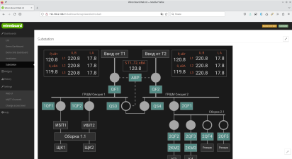
In web interface of the Wiren Board controller, you can create interactive graphical panels. With their help, it is convenient to visualize automation control schemes.
Features:
- displaying textual or logical information;
- changing the appearance of the svg element depending on the received information: you can change the style of the element, replace the received value with your own or hide / show elements;
- influence on actuators: turn on and off the load, change the operating modes of devices.
SVG panels work on mobile devices, but image size needs to be taken into account. If the elements are too small, they will be difficult to use. A good solution would be to separate graphical panels into desktop and mobile ones, which are created taking into account the characteristics of a mobile device.
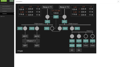
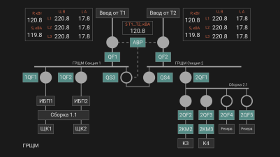
Fullscreen and HMI modes
In some tasks, you need to hide browser controls and controller web interface panels from the user, for this there is Full screen and HMi modes.
Full-screen mode allows you to switch between panels through the side menu, and in HMI mode, you need to implement the switch yourself: add a button (object) with a URL to the desired panel in the SVG image.
- Режимы панелей
Standard view
Fullscreen
HMI


Preparing
Change WebUI Access Level

To change the settings of the controller, you need the Administrator access level, which can be set in the Settings → Permissions section.
After completing the settings, we recommend that you set the access level to User or Operator - this will help you avoid making random mistakes when working with the web interface every day.
Image requirements
The basis for the SVG panel is an svg image, which we recommend creating in Inkscape - it fully supports the SVG standard without deviations.
You can output information to any text elements and set up interactions with any shapes and text.
Release wb-2307 and newer
Inside the svg file, the content tag must not contain other tags. If you uploaded a file to the controller, made a binding, downloaded this file to the computer and it did not open in the editor, open the svg file with a text editor and remove the contents of the content tag. After that you will be able to edit the file in the svg editor.
The image can be of any width and height, as well as with any number of elements.
Release wb-2304 and older
Restrictions:
- You cannot interact with the rectangle. If necessary, convert it to curves (outline).
- SVG panel editor ignores grouping. Therefore, if you need to customize the interaction with a composite element, then convert it to a single shape consisting of paths.
- Inside the svg file, the content tag should not contain other tags. If you uploaded a file to the controller, made a binding, downloaded this file to the computer and it did not open in the editor, open the svg file with a text editor and remove the contents of the content tag. After that you will be able to edit the file in the svg editor.
The image can be of any width and height, as well as with any number of elements.
Creating an SVG panel
Create a new SVG panel:
- Go to Panels → List.
- In the SVG panel section, click the Add button , the binding editor will open.
- Click the Load SVG button and select the SVG image file..
Once uploaded, the image will be displayed on the open page:
- Specify links and behavior of svg elements using link editor.
- Save the changes and see the result by clicking on the Demo button.
Don't forget to fill in the fields Identifier and Name with the unique ID of the new panel for the machine and the name for the people.
The option Stretch to full screen will fit the panel to the free space.
Syntax
In the Value fields With the Link Editor you can compose simple expressions that contain conditions and simple arithmetic operations.
MQTT topic value
The value from the MQTT topic specified in the Channel field is placed into the val variable.
Conditional expressions
Available operations:
>— greater than>=— greater than or equal to<— less than<=— less than or equal to!N !*==— equals!=— not equal
Syntax:
(CONDITION) ? 'VALUE1' : 'VALUE2'
For example, if the value of the MQTT topic is equal to 1 , then print the value ВКЛ , otherwise — ОТКЛ :
(val == 1) ? 'ON' : 'OFF'
Arithmetic operations
Simple arithmetic operations can be performed on a topic received from an MQTT topic:
+— addition-— subtraction*— multiplication/— division
For example, output the value АВАРИЯ if the value in the MQTT topic multiplied by 0.1 is greater than 20 and НОРМА otherwise:
(val*0.1>20) ? 'ALARM' : 'NORMAL'
Rounding values
Often, values from sensors come with several decimal places, if you do not need such accuracy in the svg panel, then they can be rounded:
val.toFixed(n) //round the value of the variable val to n decimal places
val.toFixed(2) //round the value of the variable val to two decimal places 220.238 → 220.24
Link Editor

The image is prepared in an external vector editor, but the assignment of links to elements is done in the controller web interface.
Чтобы связать svg-элемент изображения со значениями или событиями, выберите его мышкой, после этого рядом с изображением появятся поля настройки поведения элемента.
Кроме выделения одиночного элемента, можно выделять группу. Для этого зажмите на клавиатуре клавишу Alt и кликните по одному из элементов группы. Будет выделена группа, куда входит элемент. Повторный клик при зажатой клавише Alt выберет группу уровнем выше и так далее до самого верха иерархии.
Группы удобно использовать для создания кнопок: объединили в редакторе прямоугольник и иконку и получилась кнопка.
После настройки всех связи нажмите кнопку Сохранить.
Чтение
Отображение значений из источника в текстовом поле.
Значение из выбранного в поле Канал источника помещается в переменную val, которую нужно указать в поле Значение.
Чтобы вывести значение, просто укажите переменную:
val
К значению можно добавить произвольный текст, например, единицу измерения:
val + ' °C'
Также можно подменить полученное значение, например, заменить его на понятный человеку статус:
(val == 1) ? 'ВКЛ' : 'ОТКЛ'
Запись в канал
С помощью этой настройки вы можете записать значение в топик при клике пользователя по элементу.
Доступно два состояния ON и OFF. При клике пользователя на элементе, значение в MQTT-топике будет меняться на противоположное.
Выберите в поле Канал MQTT топик для записи значений, а в полях Значение включенного состояния и Значение выключенного состояния укажите какие значения соответствуют состояниям.
Например, для переключения реле нужно указать:
Значение включенного состояния = 1
Значение выключенного состояния = 0

С помощью переходов можно создавать многостраничные интерфейсы:
- Нарисуйте для каждой страницы свой рисунок.
- Загрузите эти рисунки в контроллер.
- Выберите для одного из трёх событий панель, куда надо переходить.
Доступны события: одиночное и длинное нажатие, а также смахивание влево и вправо.
По одиночному и длинному нажатию доступен переход на SVG и текстовые панели, а по смахиванию — только SVG. Это архитектурное ограничение, которое мы пока не модем устранить.
Видимость
Здесь можно указать при каком условии показывать элемент изображения. По умолчанию элемент будет скрыт и отобразится только пока выполняется условие.
Выберите в поле Канал MQTT-топик, на информацию из которого будет реагировать элемент, в поле Условие выберите условие, а в поле Значение — значение.
Стиль оформления
Позволяет изменять стиль элементов изображения. Можно использовать для создания обратной связи для действий, оповещения пользователя о событии т.д.
Доступные для стилизации свойства элемента:
- fill — цвет заливки;
- fill-opacity — непрозрачность заливки, значения от 0.0 до 1.0 или в процентах;
- stroke — цвет обводки;
- stroke-width — толщина обводки;
- stroke-dasharray — вид пунктирной обводки, задается в единицах длины или процентах.
- stroke-opacity — непрозрачность обводки, значения от 0.0 до 1.0 или в процентах.
Цвета можно задавать именами black, red, yellow и т.п. или шестнадцатеричными значениями #ffe680ff, #4f4f4dff и т.п..
Изменим цвет элемента в зависимости от состояния реле, если в топике значение 1, то закрашиваем объект желтым, иначе — серым:
(val == 1) ? ';fill: yellow' : ';fill: gray'
Сделаем так, чтобы при значении больше 20 обводка элемента стала красного цвета, пунктиром и толщиной 2px. При значениях меньше или равно 20 стиль элемента оставим по умолчанию:
(val > 20) ? 'stroke: red; stroke-width:2px; stroke-dasharray:2,1' : ''
Редактирование
Панель
Чтобы внести изменения:
- Откройте SVG-панель.
- Нажмите кнопку Редактировать.
- Внесите изменения и сохраните их нажатием на кнопку Демонстрация.
SVG-изображение
Релиз wb-2307 и новее
В SVG-панелях используются встроенные в файл идентификаторы (тег id), поэтому для редактирования панели просто внесите изменения в рисунок и загрузите новую версию в контроллер.
Важно! Если вы сделали привязку к группе элементов, то не разгруппировывайте эту группу! Если вам надо её изменить, просто войдите в группу в Inkscape и добавьте или удалите элементы.
Релиз wb-2304 и старее
Редактор SVG-панели в момент привязки действий к элементу прописывает data-svg-param-id, поэтому для редактирования изображения нужно его загрузить с контроллера на компьютер:
- Откройте SVG-панель для редактирования.
- В верхней части окна нажмите кнопку Download, на компьютер загрузится svg-файл.
- Отредактируйте файл в Inkscape. В Adobe Illustrator редактировать такие файлы не рекомендуем — теряются привязки, про другие редакторы информации нет.
При редактировании учтите, что если на svg-элемент была назначена связь, то он содержит скрытый data-svg-param-id и при его дублировании создается новый элемент с тем же data-svg-param-id.
Отредактируйте полученный svg-файл и вновь загрузите его на контроллер:
- В окне редактирования нажмите кнопку Выберите файл.
- После того, как кнопка Change станет активной, нажмите на нее.
Перенос на другой контроллер
Иногда нужно сделать резервную копию svg-панели, например, для переноса на другой контроллер. Для этого нужно сохранить преобразованный редактором svg-файл и описание его связей и загрузить их на другой контроллер.
Учтите, что на имена MQTT-топиков на обоих контроллерах должны совпадать. Если это не так — svg-элементы нужно будет привязать к новым MQTT-топикам.
Сохранение
Сохраните svg-файл и описание связей:
- Скачайте файл с контроллера на компьютер. Для этого нажмите на кнопку с изображением стрелки вниз.
- В редакторе svg-панели нажмите кнопку В виде JSON, скопируйте и сохраните строки в файл.
Загрузка
- Создайте новую SVG-панель по инструкции в разделе Создание SVG-панели.
- В редакторе svg-панели нажмите кнопку В виде JSON, скопируйте из сохраненного файла описание связей и вставьте текст в поле
- Нажмите кнопку Сохранить внизу страницы.
Анимация элементов SVG-панели

Элементы SVG-панели можно анимировать с помощью CSS.
Для этого нужно:
- Нарисовать SVG-панель в векторном редакторе, например, Inkscape.
- Открыть файл SVG в текстовом редакторе и добавить блок стилей, заключенный в теги
<style></style>. - В блоке стилей добавить правило @keyframes.
- Сохранить файл и загрузить его в контроллер.
- Перейти в редактор SVG-панели в веб-интерфейсе контроллера.
- Активировать параметр Style и задать в поле Value свойство animation. Также нужно задать условие при котором анимация будет срабатывать.
Визуализация в CSS осуществляется с помощью свойства animation и правила @keyframes.
@keyframes, или ключевые кадры, содержат информацию о том как должен выглядеть элемент в каждый из моментов времени.
Правило содержащее два ключевых кадра будет выглядеть так:
@keyframes <имя кейфрейма> {
from: { описание начального состояния элемента }
to: { описание конечного состояния элемента }
}
Здесь from и to ключевые слова обозначающие начальную и конечную точки анимации. Вместо них можно использовать 0% и 100%, а также добавить промежуточные значения.
Имя кейфрейма — идентификатор, по которому правило будет вызываться из описания стилей.
Чтобы анимация заработала нужно задать стилю элемента свойство animation.
Свойство animation задаёт параметры действия для анимации (длительность анимации, повторение, направление, тип движения, шаги), а в блоке @keyframes задаётся сама анимация по шагам (изменения вида и положения).
Покажем на примере создание анимации для изменения цвета текста с красного на зеленый и обратно. Так как в SVG текст выполняется заливкой, то потребуется изменять свойство fill.

- Создадим новый SVG-документ в редакторе Inlskape и добавим в него элемент Текст.
- Сохраним файл и откроем его в текстовом редакторе.
- Добавим блок style следующего вида:
  <style>
@keyframes changecolor {
   0% {fill:red}
   50% {fill:green}
   100% {fill:red}
   }
  </style>
- Сохраним SVG-файл и загрузим его в контроллер.
- В редакторе дашбордов выберем созданным тестовый элемент и зададим ему свойство animation в следующем виде:
(val > 20) ? 'animation: changecolor 3s infinite linear;' : ' '
- Так как изменение стиля элемента может происходить только по условию, в котором участвует значение из MQTT топика, то мы выбрали топик CPU Temperature и задали условие >20. Это значит, что анимация будет работать, только когда значение топика CPU Temperature больше 20.
- Сохраним дашборд и перейдем в просмотр.
Добавление внешних ссылок

Переход по внешним ссылкам задаётся на этапе создания картинки в редакторе Inkscape.
Создавать гиперссылки так:
- Выбрать элемент, который будет служить ссылкой, далее в контекстном меню Создать ссылку (hyperlink).
- Вставить в открывшееся поле ссылку.
- Сохранить.
Теперь остаётся загрузить рисунок в контроллер и проверить.