SVG-Dashboards/en: различия между версиями
(Новая страница: «=== Read === Display values from the source in a text field.») |
(Новая страница: «=== Conditional expressions === Available operations: * <code>></code> — greater than * <code>>=</code> — greater than or equal to * <code><</code> — less than * <code><=</code> — less than or equal to!N !* <code>==</code> — equals * <code>!=</code> — not equal») |
||
| Строка 247: | Строка 247: | ||
Please note that the names of the MQTT topics on both controllers must match. If this is not the case, svg elements will need to be attached to new MQTT topics. | Please note that the names of the MQTT topics on both controllers must match. If this is not the case, svg elements will need to be attached to new MQTT topics. | ||
=== Saving === | |||
Save the svg file and link description: | |||
# Download the file from the controller to your computer. To do this, click on the button with the image of a down arrow. | |||
# | # In the editor of the svg-panel, click the button '''As JSON''', copy and save the lines to a file. | ||
# | |||
=== Loading === | |||
== | # Create a new SVG panel following the instructions in the [[#Creating an SVG panel| Creating an SVG panel]]. | ||
# | # In the svg panel editor, click the '''As JSON''' button, copy the link description from the saved file and paste the text into the field | ||
# | # Click the '''Save'' button '' at the bottom of the page. | ||
# | |||
==Animation of SVG panel elements== | |||
[[File:animation-svg.gif|598x|thumb|right| SVG panel element animation example]] | |||
[[ | SVG panel elements can be animated using CSS. | ||
<div lang="ru" dir="ltr" class="mw-content-ltr"> | <div lang="ru" dir="ltr" class="mw-content-ltr"> | ||
Версия 12:54, 4 августа 2023


Introduction

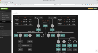
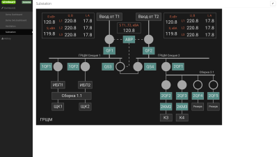
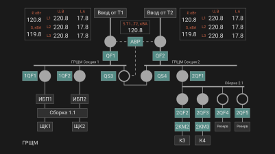
In web interface of the Wiren Board controller, you can create interactive graphical panels. With their help, it is convenient to visualize automation control schemes.
Features:
- displaying textual or logical information;
- changing the appearance of the svg element depending on the received information: you can change the style of the element, replace the received value with your own or hide / show elements;
- influence on actuators: turn on and off the load, change the operating modes of devices.
SVG panels work on mobile devices, but image size needs to be taken into account. If the elements are too small, they will be difficult to use. A good solution would be to separate graphical panels into desktop and mobile ones, which are created taking into account the characteristics of a mobile device.
Fullscreen and HMI modes
In some tasks, you need to hide browser controls and controller web interface panels from the user, for this there is Full screen and HMi modes.
Full-screen mode allows you to switch between panels through the side menu, and in HMI mode, you need to implement the switch yourself: add a button (object) with a URL to the desired panel in the SVG image.
- Режимы панелей
Standard view
Fullscreen
HMI


Preparing
Change WebUI Access Level

To change the settings of the controller, you need the Administrator access level, which can be set in the Settings → Permissions section.
After completing the settings, we recommend that you set the access level to User or Operator - this will help you avoid making random mistakes when working with the web interface every day.
Image requirements
The basis for the SVG panel is an svg image, which we recommend creating in Inkscape - it fully supports the SVG standard without deviations.
You can output information to any text elements and set up interactions with any shapes and text.
Release wb-2307 and newer
Inside the svg file, the content tag must not contain other tags. If you uploaded a file to the controller, made a binding, downloaded this file to the computer and it did not open in the editor, open the svg file with a text editor and remove the contents of the content tag. After that you will be able to edit the file in the svg editor.
The image can be of any width and height, as well as with any number of elements.
Release wb-2304 and older
Restrictions:
- You cannot interact with the rectangle. If necessary, convert it to curves (outline).
- SVG panel editor ignores grouping. Therefore, if you need to customize the interaction with a composite element, then convert it to a single shape consisting of paths.
- Inside the svg file, the content tag should not contain other tags. If you uploaded a file to the controller, made a binding, downloaded this file to the computer and it did not open in the editor, open the svg file with a text editor and remove the contents of the content tag. After that you will be able to edit the file in the svg editor.
The image can be of any width and height, as well as with any number of elements.
Creating an SVG panel
Create a new SVG panel:
- Go to Panels → List.
- In the SVG panel section, click the Add button , the binding editor will open.
- Click the Load SVG button and select the SVG image file..
Once uploaded, the image will be displayed on the open page:
- Specify links and behavior of svg elements using link editor.
- Save the changes and see the result by clicking on the Demo button.
Don't forget to fill in the fields Identifier and Name with the unique ID of the new panel for the machine and the name for the people.
The option Stretch to full screen will fit the panel to the free space.
Syntax
In the Value fields With the Link Editor you can compose simple expressions that contain conditions and simple arithmetic operations.
MQTT topic value
The value from the MQTT topic specified in the Channel field is placed into the val variable.
Conditional expressions
Available operations:
>— greater than>=— greater than or equal to<— less than<=— less than or equal to!N !*==— equals!=— not equal
Syntax:
(CONDITION) ? 'VALUE1' : 'VALUE2'
For example, if the value of the MQTT topic is equal to 1 , then print the value ВКЛ , otherwise — ОТКЛ :
(val == 1) ? 'ON' : 'OFF'
Arithmetic operations
Simple arithmetic operations can be performed on a topic received from an MQTT topic:
+— addition-— subtraction*— multiplication/— division
For example, output the value АВАРИЯ if the value in the MQTT topic multiplied by 0.1 is greater than 20 and НОРМА otherwise:
(val*0.1>20) ? 'ALARM' : 'NORMAL'
Rounding values
Often, values from sensors come with several decimal places, if you do not need such accuracy in the svg panel, then they can be rounded:
val.toFixed(n) //round the value of the variable val to n decimal places
val.toFixed(2) //round the value of the variable val to two decimal places 220.238 → 220.24
Link Editor

The image is prepared in an external vector editor, but the assignment of links to elements is done in the controller web interface.
To associate an image svg element with values or events, select it with the mouse, after which fields for setting the element's behavior will appear next to the image.
In addition to selecting a single element, you can select a group. To do this, hold down the Alt key on your keyboard and click on one of the elements of the group. The group containing the element will be highlighted. Clicking again while holding down the Alt key will select the group one level higher and so on up to the very top of the hierarchy.
Groups are convenient to use for creating buttons: we combined a rectangle and an icon in the editor and got a button.
After setting up all connections, click the Save button.
Read
Display values from the source in a text field.
The value from the source selected in the Channel field is placed in the val variable, which must be specified in the Value field.
To display the value, just specify the variable:
val
You can add arbitrary text to the value, for example, the unit of measure:
val + '°C'
You can also change the received value, for example, replace it with a human-readable status:
(val == 1) ? 'ON' : 'OFF'
Write to channel
With this setting you can write a value to the topic when the user clicks on the element.
There are two states ON and OFF. When a user clicks on an element, the value in the MQTT topic will change to the opposite.
In the Channel field, select the MQTT topic for writing values, and in the On State Value and Off State Value fields specify which values correspond to the states.
For example, to switch a relay, specify:
On value = 1
Off value = 0
Jump and swipe

Using transitions, you can create multi-page interfaces:
- Draw a custom picture for each page.
- Load these pictures into the controller.
- Select a panel for one of the three events to navigate to.
Events available: single and long press, as well as swipe left and right.
By single and long pressing, the transition to SVG and text panels is available, and by swiping - only SVG. This is an architectural limitation that we are not yet able to fix.
Visibility
Here you can specify under what condition to show the image element. By default, the element will be hidden and displayed only while the condition is met.
In the Channel field, select the MQTT topic that the element will respond to, in the Condition field, select a condition, and in the Value field, select a value.
Design style
Allows you to change the style of image elements. Can be used to create feedback for actions, notify the user about an event, etc.
Element properties available for styling:
- fill — fill color;
- fill-opacity — fill opacity, values from 0.0 to 1.0 or as a percentage;
- stroke — stroke color;
- stroke- width — stroke thickness;
- stroke-dasharray — dashed stroke type, set in units of length or percentage.
- stroke-opacity — stroke opacity, values from 0.0 to 1.0 or percentage.
Colors can be named black, red, yellow и т.п. or hex values #ffe680ff, #4f4f4dff и т.п. .
Let's change the color of the element depending on the state of the relay, if the value in the topic is 1 , then paint the object yellow, otherwise - gray:
(val == 1) ? ';fill: yellow' : ';fill: gray'
Let's make it so that when the value is greater than 20, the stroke of the element becomes red, dotted and 2px thick. For values less than or equal to 20, the element style will be left by default:
(val > 20) ? 'stroke: red; stroke-width:2px; stroke-dasharray:2,1' : ''
Editing
Panel
To make changes:
- Open the SVG panel.
- Click on the Edit button.
- Make changes and save them by clicking on the ' button Demonstration'.
SVG Image
Release wb-2307 and newer
SVG panels use identifiers embedded in the file (the id tag), so to edit the panel, simply make changes to the drawing and upload the new version to the controller.
Important! If you have made a binding to a group of elements, then do not ungroup this group! If you need to change it, just go to the group in Inkscape and add or remove elements.
Release wb-2304 and older
The SVG panel editor assigns data-svg-param-id at the time of binding actions to the element, so to edit the image, you need to load it from the controller to the computer:
- Open the SVG panel for editing.
- At the top of the window, click the Download button, the svg file will be downloaded to your computer.
- Edit the file in Inkscape. We do not recommend editing such files in Adobe Illustrator - bindings are lost, there is no information about other editors.
When editing, keep in mind that if a link was assigned to an svg element, then it contains a hidden data-svg-param-id and when it is duplicated, a new element is created with the same data-svg-param-id.
Edit the resulting svg file and upload it to the controller again:
- In the edit window, click the Select File button.
- After the Change button becomes active, click on her.
Transfer to another controller
Sometimes you need to make a backup copy of the svg-panel, for example, to transfer to another controller. To do this, you need to save the svg file converted by the editor and the description of its links and upload them to another controller.
Please note that the names of the MQTT topics on both controllers must match. If this is not the case, svg elements will need to be attached to new MQTT topics.
Saving
Save the svg file and link description:
- Download the file from the controller to your computer. To do this, click on the button with the image of a down arrow.
- In the editor of the svg-panel, click the button As JSON, copy and save the lines to a file.
Loading
- Create a new SVG panel following the instructions in the Creating an SVG panel.
- In the svg panel editor, click the As JSON button, copy the link description from the saved file and paste the text into the field
- Click the Save button at the bottom of the page.
Animation of SVG panel elements

SVG panel elements can be animated using CSS.
Для этого нужно:
- Нарисовать SVG-панель в векторном редакторе, например, Inkscape.
- Открыть файл SVG в текстовом редакторе и добавить блок стилей, заключенный в теги
<style></style>. - В блоке стилей добавить правило @keyframes.
- Сохранить файл и загрузить его в контроллер.
- Перейти в редактор SVG-панели в веб-интерфейсе контроллера.
- Активировать параметр Style и задать в поле Value свойство animation. Также нужно задать условие при котором анимация будет срабатывать.
Визуализация в CSS осуществляется с помощью свойства animation и правила @keyframes.
@keyframes, или ключевые кадры, содержат информацию о том как должен выглядеть элемент в каждый из моментов времени.
Правило содержащее два ключевых кадра будет выглядеть так:
@keyframes <имя кейфрейма> {
from: { описание начального состояния элемента }
to: { описание конечного состояния элемента }
}
Здесь from и to ключевые слова обозначающие начальную и конечную точки анимации. Вместо них можно использовать 0% и 100%, а также добавить промежуточные значения.
Имя кейфрейма — идентификатор, по которому правило будет вызываться из описания стилей.
Чтобы анимация заработала нужно задать стилю элемента свойство animation.
Свойство animation задаёт параметры действия для анимации (длительность анимации, повторение, направление, тип движения, шаги), а в блоке @keyframes задаётся сама анимация по шагам (изменения вида и положения).
Покажем на примере создание анимации для изменения цвета текста с красного на зеленый и обратно. Так как в SVG текст выполняется заливкой, то потребуется изменять свойство fill.

- Создадим новый SVG-документ в редакторе Inlskape и добавим в него элемент Текст.
- Сохраним файл и откроем его в текстовом редакторе.
- Добавим блок style следующего вида:
  <style>
@keyframes changecolor {
   0% {fill:red}
   50% {fill:green}
   100% {fill:red}
   }
  </style>
- Сохраним SVG-файл и загрузим его в контроллер.
- В редакторе дашбордов выберем созданным тестовый элемент и зададим ему свойство animation в следующем виде:
(val > 20) ? 'animation: changecolor 3s infinite linear;' : ' '
- Так как изменение стиля элемента может происходить только по условию, в котором участвует значение из MQTT топика, то мы выбрали топик CPU Temperature и задали условие >20. Это значит, что анимация будет работать, только когда значение топика CPU Temperature больше 20.
- Сохраним дашборд и перейдем в просмотр.
Добавление внешних ссылок

Переход по внешним ссылкам задаётся на этапе создания картинки в редакторе Inkscape.
Создавать гиперссылки так:
- Выбрать элемент, который будет служить ссылкой, далее в контекстном меню Создать ссылку (hyperlink).
- Вставить в открывшееся поле ссылку.
- Сохранить.
Теперь остаётся загрузить рисунок в контроллер и проверить.